Why is it that some things look better in black and white than they do in color? You’d think that color would inevitably be preferable, but it just isn’t (do you hear me, Ted Turner?). Casablanca. Henri Cartier-Bresson’s street photography. The Three Stooges. Color would not improve these; in fact, it would be a distraction, an unnecessary and unwelcome complication. Even some of Your Humble Filmosaur’s modest efforts fall under this classification. To wit, one of the more popular shots I’ve posted; color would not do anything for this photo, and might well make it less interesting:

Apparently a bunch of you lot agree with this sentiment, judging by the responses to my recent “Week’s Vacation” series. I deliberately posted alternating black & white and color photos; mostly an aesthetic choice, but I was a bit curious about which would draw more attention. The net result was an average of 12 likes per B&W photo and 5.667 per color photo. (I am not a statistician nor do I play one on TV, but I’ve got a calculator and I’m not afraid to use it).
Now, you might argue that the color photos were just slightly less than half as good as the black & whites. Fair enough. But extending things out to a slightly larger sample size – all of my “Semi-Random Photo” posts and you get averages of 11.643 likes per B&W photo and 7.692 per color photo. Do my color pictures really suck 1.514 times more than my black & whites, or is something else going on here?
This is fascinating to me. Apparently, in this age of speed-of-light interweb and kajillion-color multi-gigapixel photography, what the world wants (at least this little corner of it) is grainy black & white pictures. Who’da thunk?
Yet color being somehow “better” than black & white clearly does not hold up as a universal statement; some photos are all about color. Just look at this example – first the original:
And now desaturated:

It’s not that the black & white version is a bad photo (to my eyes), but the color in the original is what makes it stand out.
So what’s going on? I have my own ideas, but I would really like to hear some readers’ thoughts on this, not just as it relates to the photos you see here, but on the whole color vs. black & white question. The “Comment” button is tucked away up there in the header – go use it!

even when the color version has nice complementary yellows and blues which makes it attractive I do like more the B&W version.. that however, is maybe a bit biased by the fact that I am only showing monochromes… let’s see what others have to say here…
That’s interesting – I tried to select a photo that to my eye was one in which color was clearly a benefit, but you still preferred the B&W version. Was there a particular element of the monochrome version that you specifically preferred, or was it just a matter of the overall look of the image?
it was more the overall looking, maybe I should have a closer look… but after all what counts for your question here is the first impression (I think…)
Fair enough – I was just curious if it was personal preference (in which first look is likely the deciding factor) or some specific thing you saw that swayed you.
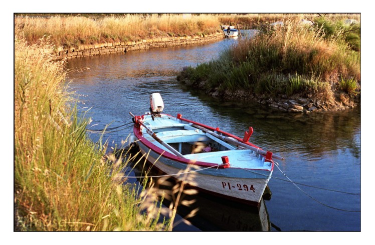
I was ‘brought up’ on black and white – we’re talking between 65 and 50 years ago – but when colour came along in a big way I shot no B&W for many years, this continuing when I went ‘digital’ about 12 years ago. Returning to film as a hobby fairly recently (I now use digital only for work or for the ‘product’ shots of my classic cameras on the blog) I’ve been drawn more and more to B&W and, when I’ve used up my stock of colour film I may well buy no more, especially as I’m trying to set up a kind of dark room which will not be equipped for colour. That I think is the only downside to B&W – it’s on the print, not on the computer screen, that it really comes into it’s own. So much of the colour photos we see is, in my opinion, just down to the digital camera – desaturate them and they become pretty uninteresting (though there are many digital photographers who I follow where this is not the case, ie they are the photographer, not the camera). Take the colour out and the photographer has to concentrate on the composition or some other aspect, eg in ‘street photography’. As far as the boat pic is concerned, I agree with Vincent and prefer the B&W, though for my taste it needed to have the contrast upped a bit when desaturated and I’d have put the boat towards top left and had the river leading in to it if taking it as B&W in the first place.
It’s a very interesting debate.
Your experience is interesting, as you’ve had the opportunity to see the evolution of the relationship between B&W and color photography change considerably. I tend to agree that color is often used as a crutch, especially in the hyper-saturated digital realm, leading to a rather lax approach to composition; indeed, one of the reasons I like to shoot B&W is that I feel I tend to learn more from it.
As to the boat, yes, I could have tweaked it a bit more and probably improved it a little. The composition in this case, however, was dictated more by topography than anything else. The boat was at the very end of the channel surrounded by high banks and walls; the sort of composition you suggest (which I do not disagree with) would have required building permits and heavy equipment. A bit more than I was willing to undertake for a photo.
I know what you mean; it can be frustrating when you can’t get to the viewpoint you want – but anyway you were shooting in colour and it works fine as it is with colour. As for veering towards B&W, I use the WordPress widget to feature ‘Posts I’ve recently liked’ in the right sidebar; I’ve just noticed that more and more of them are B&W – the majority as it stands at the moment.
It’s always interesting to me to see what people gravitate to. I don’t think you’re alone in tending to like B&W; in fact, it seems like there’s an obscure little corner of the internet dedicated to traditional photography, and more and more those populating it are being drawn this way. I know that the increasing prevalence of oversaturated digital color often makes me long for some simple B&W (preferably well-done and film-based).